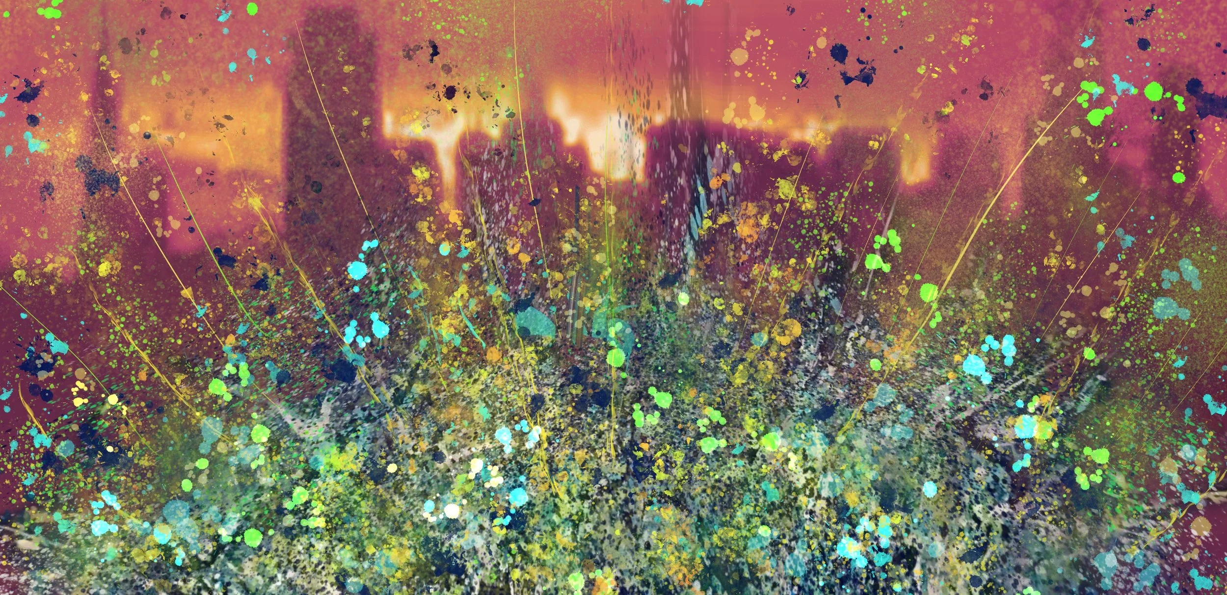
Fiery The Angels Fell
“I honestly can’t express how impressed I am and thankful for the effort that you’ve put into it”
The Client contacted us, having previously seen some of our artwork, with quite a specific & unique commission request. They had chosen two pieces that they particularly liked but wanted to combine the two in terms of style & colours, as well as introducing a third element into the mix - a feeling of looming dystopia! After several discussions it was agreed that the piece should incorporate a colourful detonation style foreground set against a contradicting, dystopian/apocalyptic inspired skyline. The premise was to create a piece of art that expressed an overall sense of strength & immutability (yes - we had to look it up as well!) emerging triumphantly from an emotionally charged & despairing background. Simple!
Inspired by the challenge and excited at the prospect of pushing himself in a diverse artistic direction, Al got to work. He came up with some initial digitally produced designs based on the remit provided and awaited feedback from the Client.
The first component to confirm was the background - in terms of both the composition of the city-scape skyline and the colours best suited to convey an imposing and dystopian backdrop. The Client had provided a photo of the room in which the artwork would eventually be hung - so it was quickly established that a darkish orange/crimson background with a bright explosion of colour in the foreground was the way to go. Again, Al provided updated designs with this colour scheme in mind and, once agreed, work began….
As with all commission work, photo updates were shared with the Client as the piece took shape. On this occasion Al had decided to create two separate pieces - just because the requirement involved some quite intrinsic stencilling outside his usual style.
The Client had already requested Green, Blue, Yellow & White tones be used for the detonation section. Obviously the skyline needed to be both visible & recognisable - so it was vital that the explosion of colour did not distract or overwhelm the overall composition and needed to be contained. To ensure this was not the case, Al began by using a brush effect to push and fade out a base layer of initial colours before applying the energetic splatter element over the top - mindful of the fact the skyline was still to remain obvious & distinguishable.
After a few more discussions and feedback from the Client, both pieces were completed and the results were highly pleasing. High Resolution photos and video clips of both pieces were sent over to the Client - including digital interpretations of how both would look in the Clients home (in various framing options).
Piece One -
Piece Two -
The Client eventually chose Piece One in a black tray frame - feeling that the slightly thicker blend of base colours added just a little something extra and captured exactly what they were after. As with all Commission pieces, the Client is asked if they would like to name their new artwork themselves. However, on this occasion, the Client was very happy to go with a suggestion made by Al to use a quote from the film Blade Runner ”Fiery The Angels Fell”.
During early discussions, Blade Runners apocalyptic imagery and rebellious sentiment had been cited as an example of how the Client had wanted the art to feel - so using this quote (which is actually a misquote taken from a Blake poem - America: a Prophecy) as the title of the piece, seemed totally appropriate and perfectly aligned.
Sometimes when working on a Commission project, especially where an emotion or particular context is requested in addition to visual impact, it can take a while for Client and Artist to come together and establish an idea or concept. As in most cases though, Al and the Client quickly established a genuinely harmonic and enjoyable working relationship that really bore fruit - allowing them to successfully create a stunning piece of art, totally in line with the original remit.


